Table Designer
The Table Designer app is located under Application Design Tools on the System menu. It provides a list of all current tables and their attributes.
Use the search tool to find the Table Designer app, or browse to the app via the System/Application Design Tools menu.
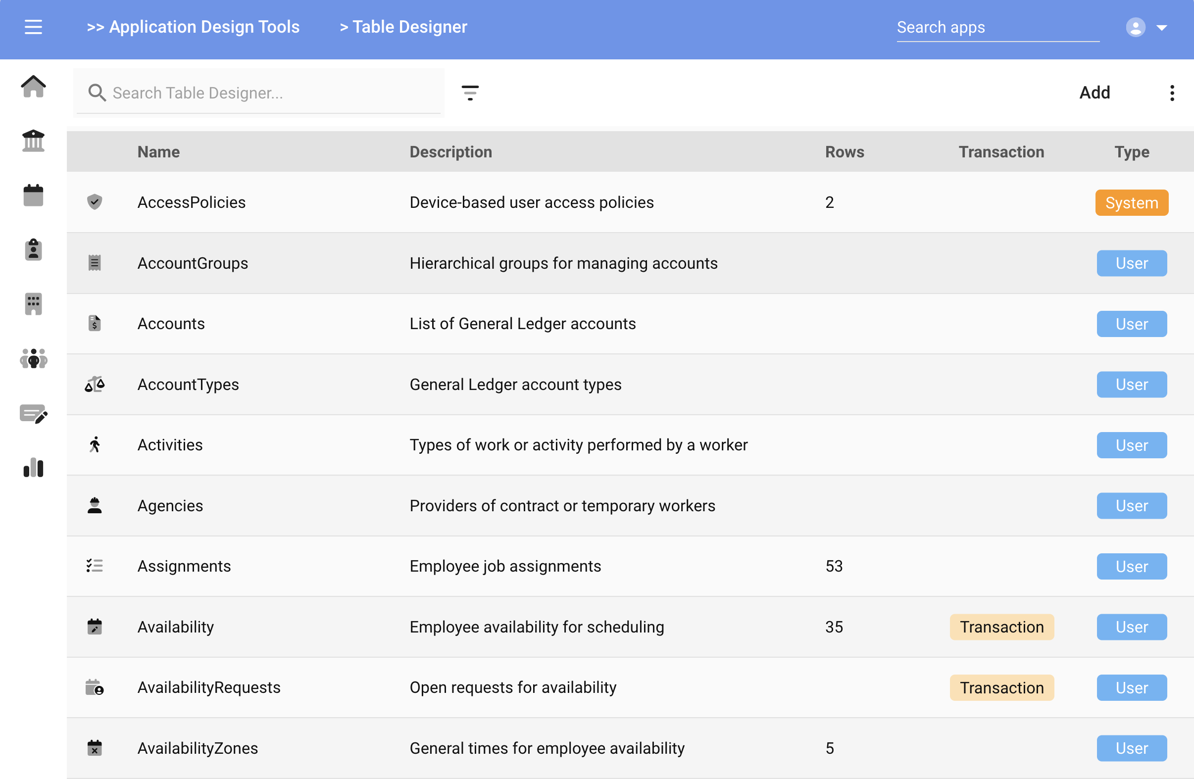
The Transaction and Type designations, as described in the previous page, are listed in the appropriate column.
Add Table Wizard
Use the Add button on the Table Designer app launches the Add Table wizard.
The Add Table Wizard will prompt for the following items:
- Table Name - The name of the table. Alphanumeric with no spaces or special characters.
- Description - A description of the type of data you'll store in this table
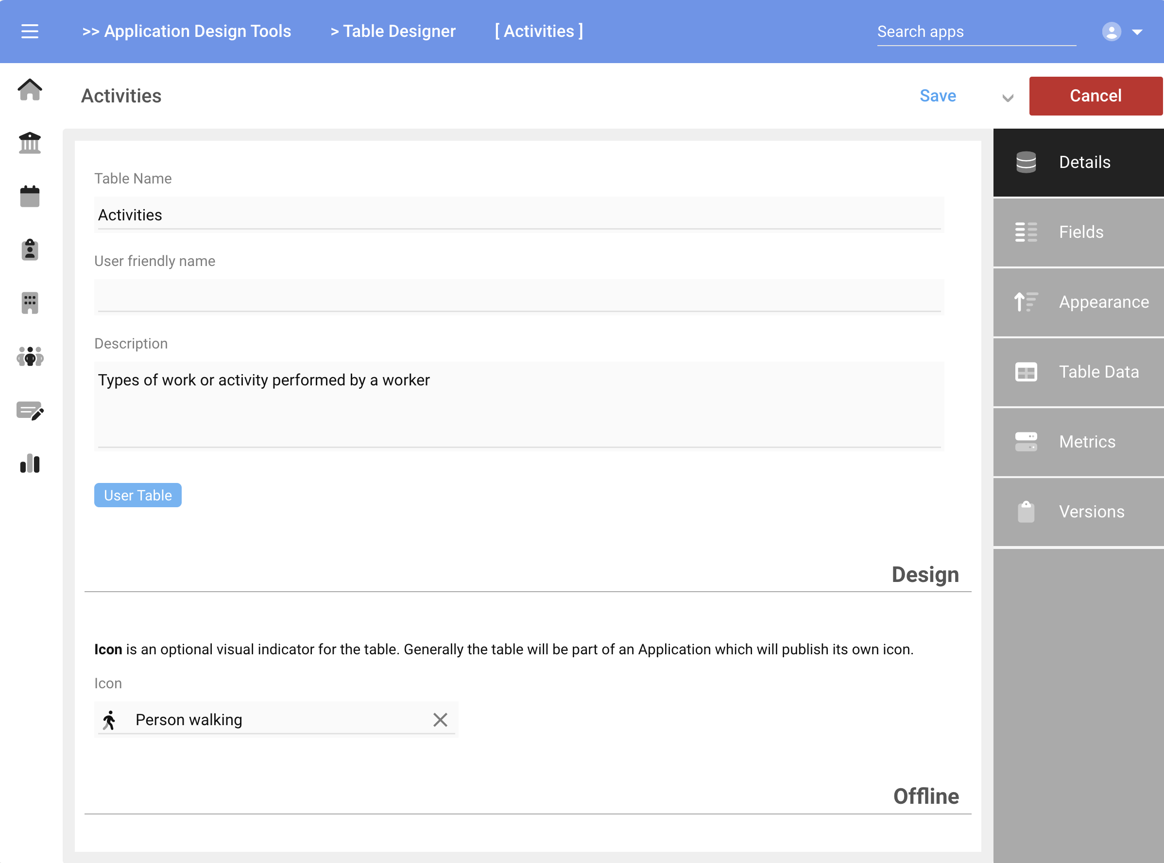
- Icon - Choose an icon to represent the table
Next
- Transactional data - check this box if the table will contain transactional data (see Introduction for details)
- Calendar data - check this box if the table will contain an Event field for use in calendar-style apps. You can add Event fields in the next step if needed.
Save
The wizard will end with the Table Designer app displayed. Continue filling out the various sections of the app as outlined in the next sections.
Details
The field gathered by the Add Table Wizard are pre-populated in the Table Designer app. Use the card tabs on the right hand side to navigate between the sections of the app.
Offline Mode
You may want to make some Tables available offline, such as in the case of a time clock where network connectivity is not guaranteed and transactions are desired to continue. In this case, the data (such as Punch Actions, Departments or Cost Centers) may need to be cached offline inside the clock or device for access by an app.
To enable offline mode for a table, check the
Make available offlinecheckbox under the Offline section.
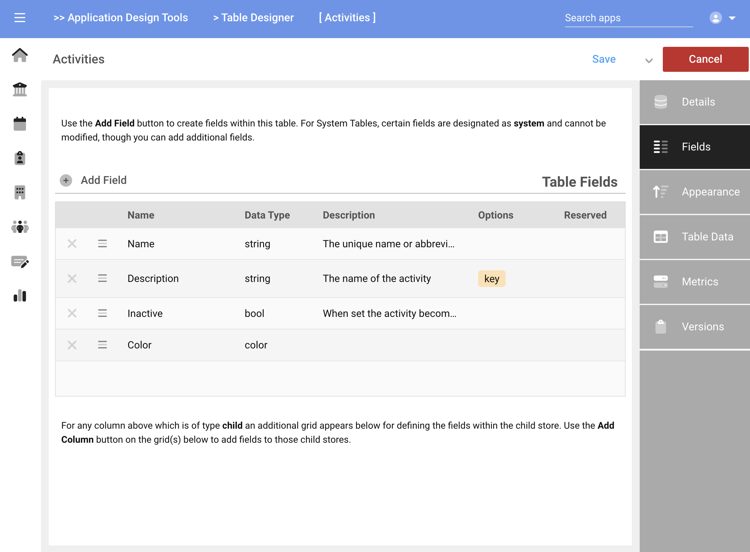
Fields
The Fields card reveals the list of data fields within the Table. When creating a new Table, certain default fields such as Name and Description are pre-populated. In addition, if you chose Transaction or Calendar then those fields are also pre-populated.
Fields are added via the Add Field button. You can also reorder or remove fields using the handles at the left of each row.
Reordering is only for organization purposes and has no impact on the data.
Data is never deleted from the platform, therefore if a Field is removed from the field list, the data still resides in the record. You can reconnect to it by adding the field back with the same name.
Adding A Field
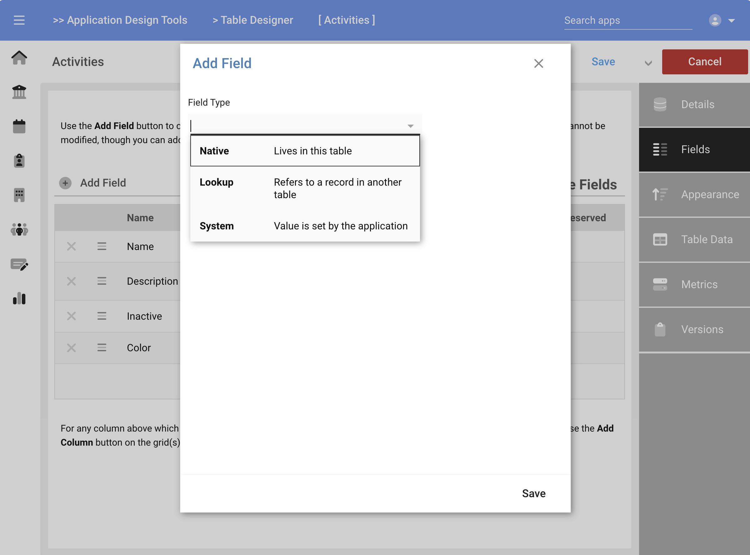
Press the Add Field button to add a new field. There are three types of fields you can add to a Table:
- Native: a field that lives in the Table and is filled in by the user
- Lookup: a field that lives in a different table and will be looked-up or searched for by the user or a workflow
- System: a field that will be auto-populated by the system but still stored in the Table
The remaining attributes of the field will vary based on the field type chosen.
Provide the following values where prompted:
- Field Name: the name of the field. The Name can contain spaces, though special characters are not allowed. As a general guideline, its better to use case or "_" to separate words versus spaces.
- Friendly Name: If desired, can enter an alias which does contain spaces to make reading forms easier. For example, if the FieldName is "Firstname", then any forms or apps which display the field will show it as "Firstname". You could enter "First name" in this field to have the system substitute this alias wherever the field is presented. The underlying field would still be known as "Firstname". This value is optional and defaults to FieldName when left blank.
- Data Type: choose the type of data field from the dropdown. See Data Types for a full description
- List of enumerated values: When choosing
stringorlistdata types, the option to create a structured list of options is presented in this field. The system will present a dropdown of choices to the user from which they can select a value. The resultant selection (string value) will be stored in the field - Description: provide a description of the field, or its purpose
- Key field: check to include this field when other Tables are performing searches on this Table's data. Generally the Description or Name and Description are chosen as Key fields.
- Readonly: check to indicate the field is readonly. This is used for calculated or imported values that should not be changed by users through apps or forms
- Vault: check to enable the Vault mode on this field (see description below)
- Lookup Table: when a Lookup field is added, this specifies a different table from which a lookup is performed. A reference to the remote record is stored in the current field. For example, if the lookup table is Departments, then the system automatically creates the field name of "Departments_ID", meaning the unique ID from a row in the Departments Table will be stored in this record as "Departments_ID". In this way, whenever you see a field named "Tablename_ID", it means that the unique ID from a row in the table "Tablename" is being stored in the current record.
- Lookup Relationship: the choices are
one-to-oneorone-to-many. The former means the user can only select one item from the lookup table, while the latter allows multi-selection.
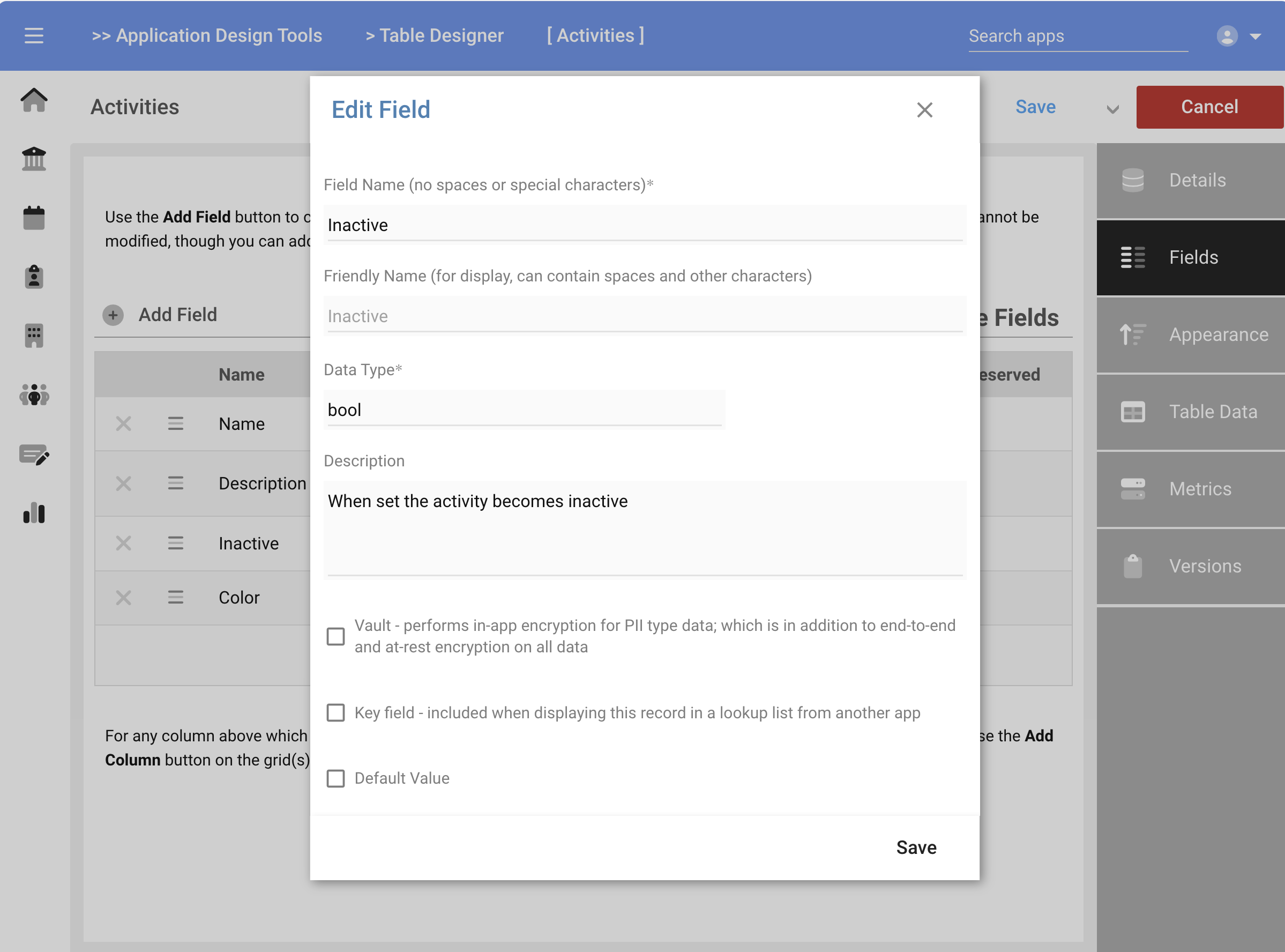
Press Save when complete to add the field to the Table.
Best practice is to have a Name and Description field as the first two in every table. There are times when those may not make sense (as in the case of Employees) but most things can use a unique primary identifier (Name) and a secondary descriptor (Description).
Appearance
The Appearance card allows you to control how the data in this table is presented in lookups or when searching.
Lookups
The Lookup Template manages the appearance of each record when the table is the target of a search. By default, the system uses the declared Key fields to create a lookup template for the table. For example, if the current table declares Description as the Key field, then only the Description will be displayed to the user when making a selection.
Alternatively, you could build a Lookup Template to control which fields are displayed and in which order. Templates use curly braces to notate field names, so the Description field would be referenced as {Description}. This allows for including additional text or characters, line breaks, styling and other embellishments in the lookup.
Here are a few examples of Lookup Templates and their outputs:
{Name} - {Description}
ADMIN - Administration
{Description} ({Name})
Administration (ADMIN)
{Name} <br> {Description}
ADMIN
Administration
For simple tables and applications, using the Key property, then leaving the Lookup Template blank presents the easiest solution.
Sorting
Sorters are used to control the native order of data when presented in a list or application. You can add one or more Sorters to a Table, such as Name followed by Description. Values are always sorted in the order the Sorters are presented in the list, such that duplicates of the first sorter are then sub-sorted by the secondary sorter, etc.
Press the
Add Sorterbutton to add a sorter. Use the handles on the left side of each row to reorder or remove a sorter
The values presented in the Add Sorter dialog are:
- Column: select a field/column from the fields list
- Direction: choose from Ascending or Descending (backwards)
Table Data
The Table Data card provides a read-only view into the rows stored in the table (if reviewing an existing table for which data has been entered). You cannot modify the data here, but is helpful to review contents or if a table is being used.
Metrics
The Metrics card shows performance attributes of the table, such as number of rows, data size and other metadata. This information is mostly academic as there are no practical limits on data sizes.
| Name | Description |
|---|---|
| Rows | The number of rows in the table |
| Row Length | The average row size |
| Data Length | Current provisioned space |
| Index Length | Space allocated for indexes |
| Data Free | Unused allocated space (allocates more as needed) |
| AutoIncrement | Next internal ID for new rows |